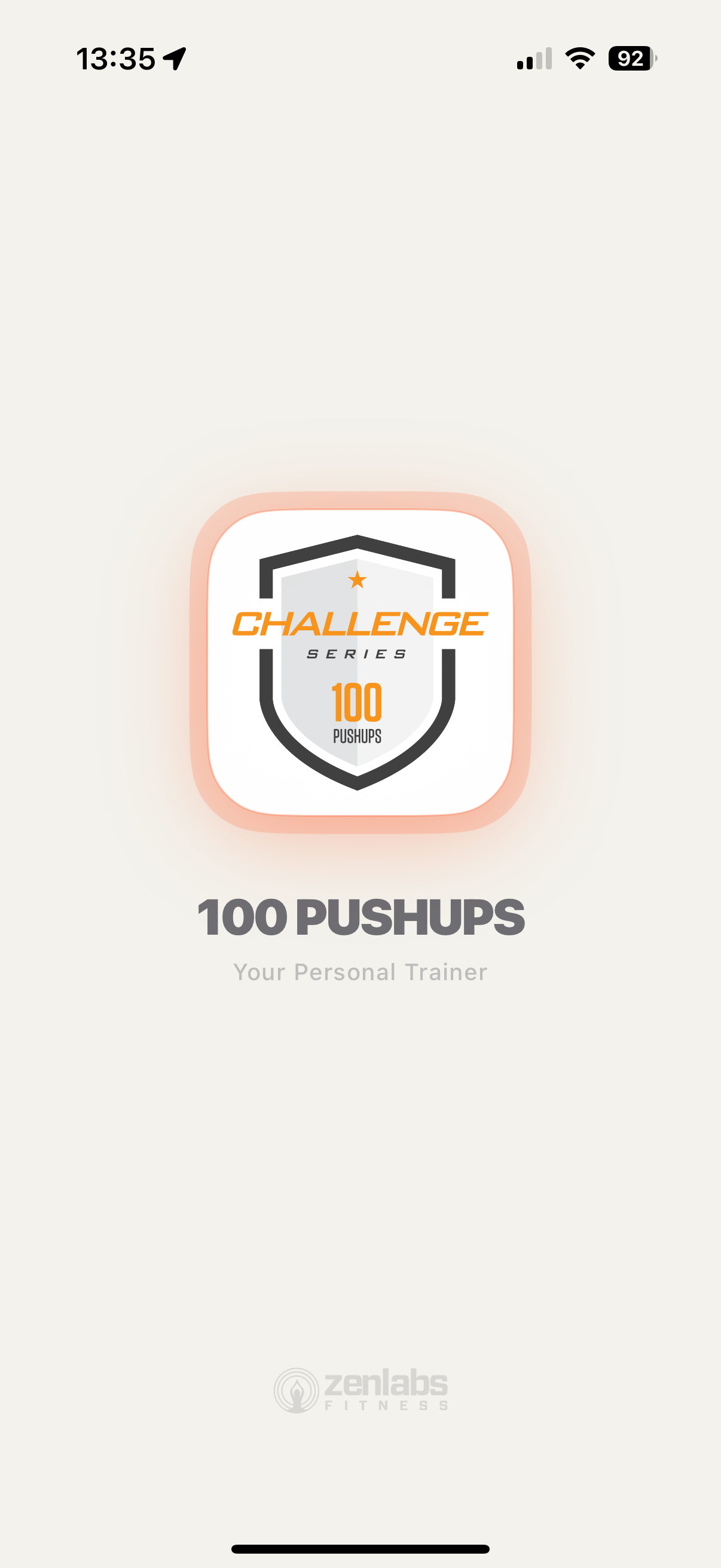
Screen 01 · Splash
First impression matters.
The launch screen sets the tone. The old app used a plain white canvas with a flat logo. The new app opens with a dramatic dark stage, a glowing icon, and a confident "Your Personal Trainer" tagline.
Before
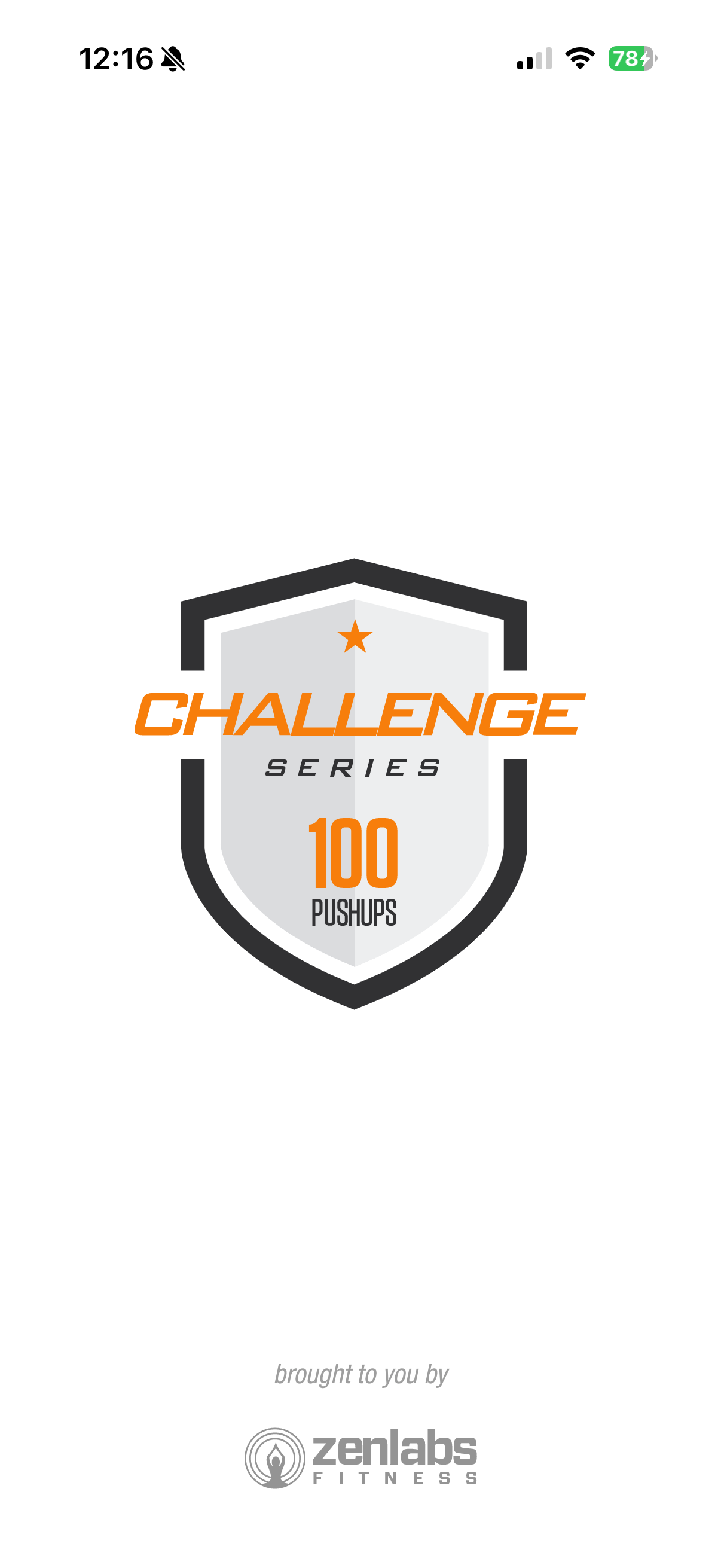
White background — jarring in dark environments
Flat, static logo with no personality
Small "brought to you by" feels like an afterthought
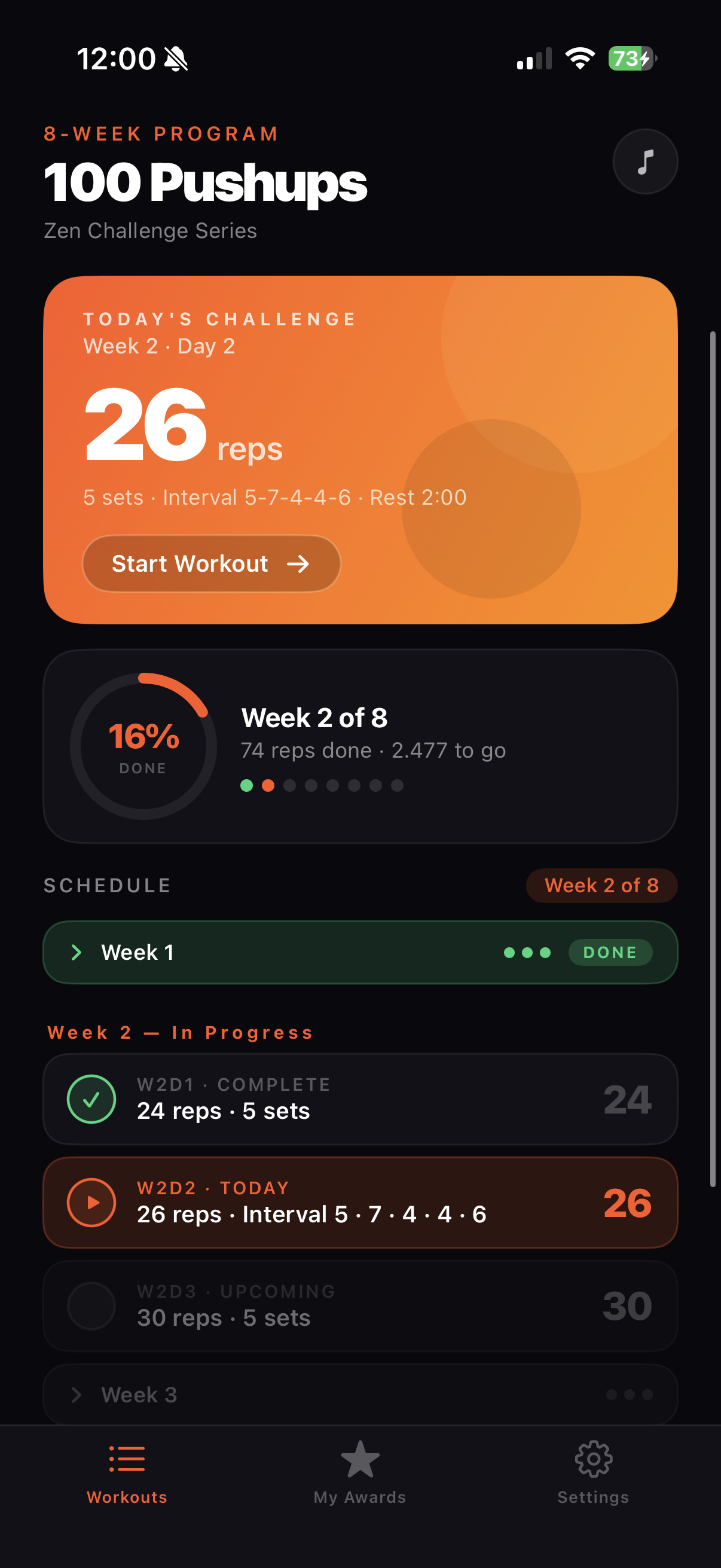
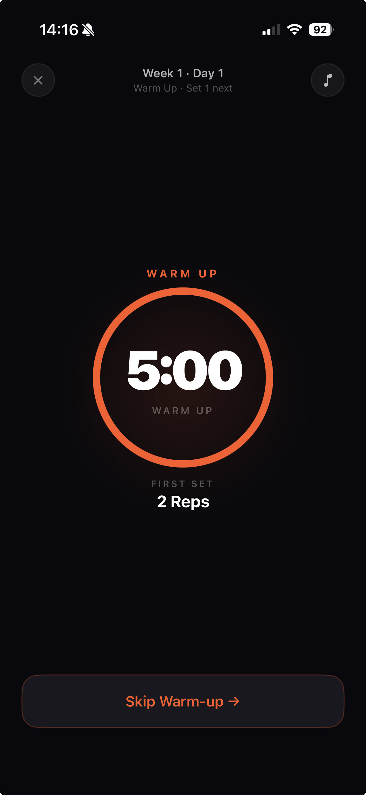
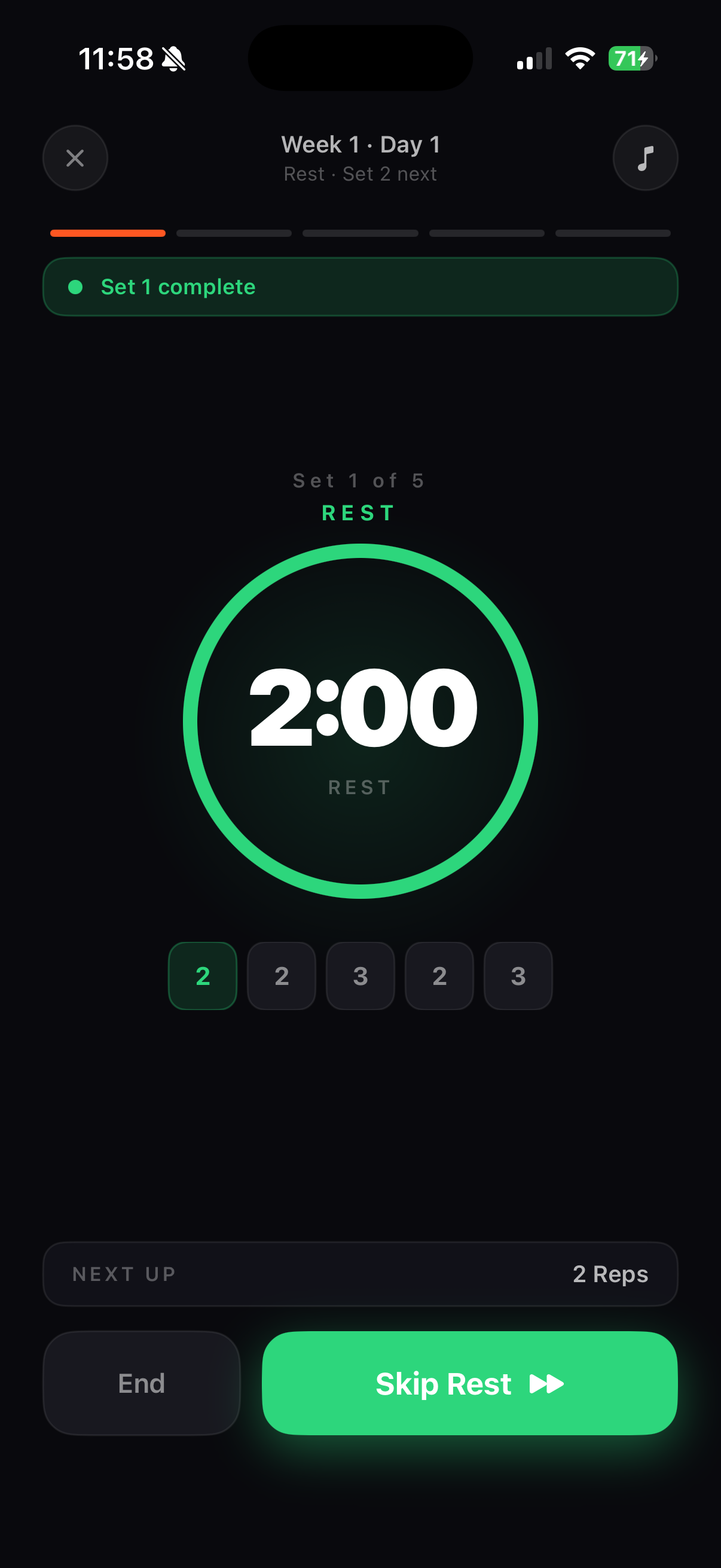
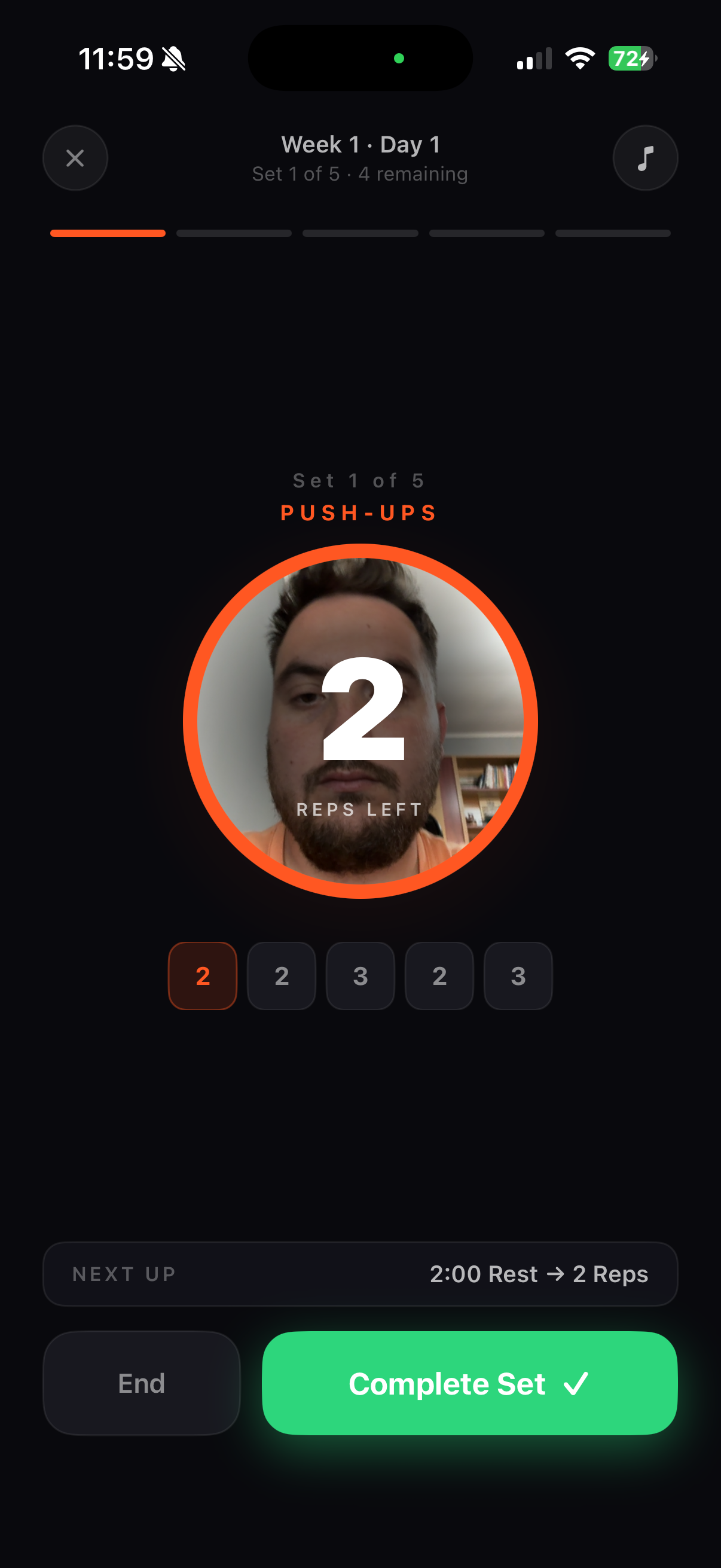
◑ After · Dark
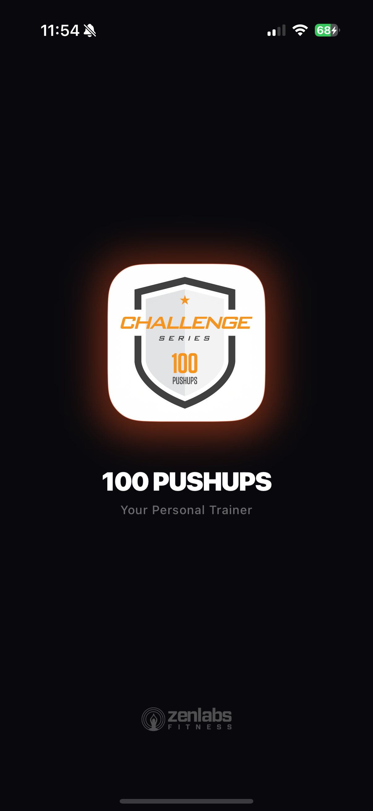
Dark background with warm orange glow — premium from the first frame
Icon glows with depth, as if lit from within
"Your Personal Trainer" positions the app as a coaching tool
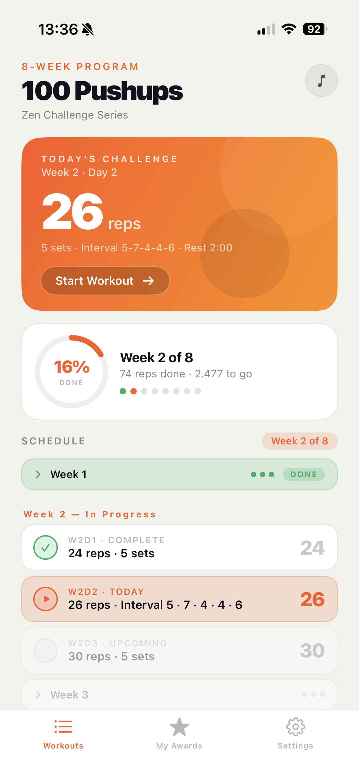
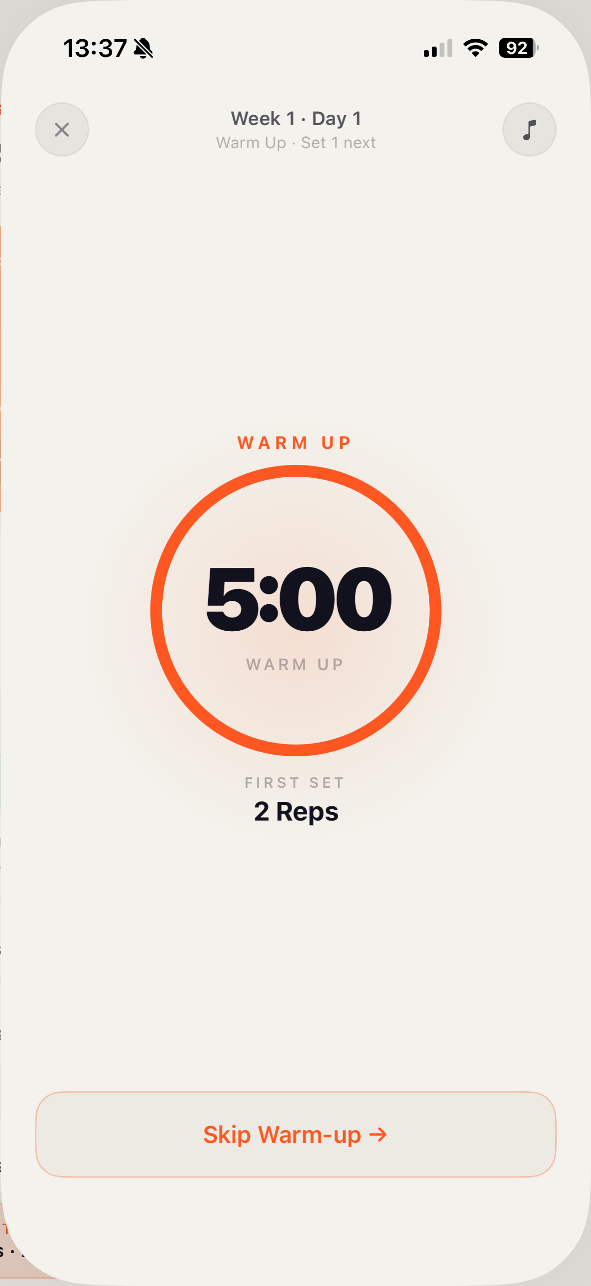
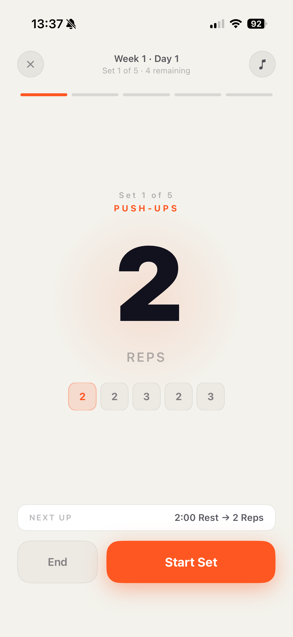
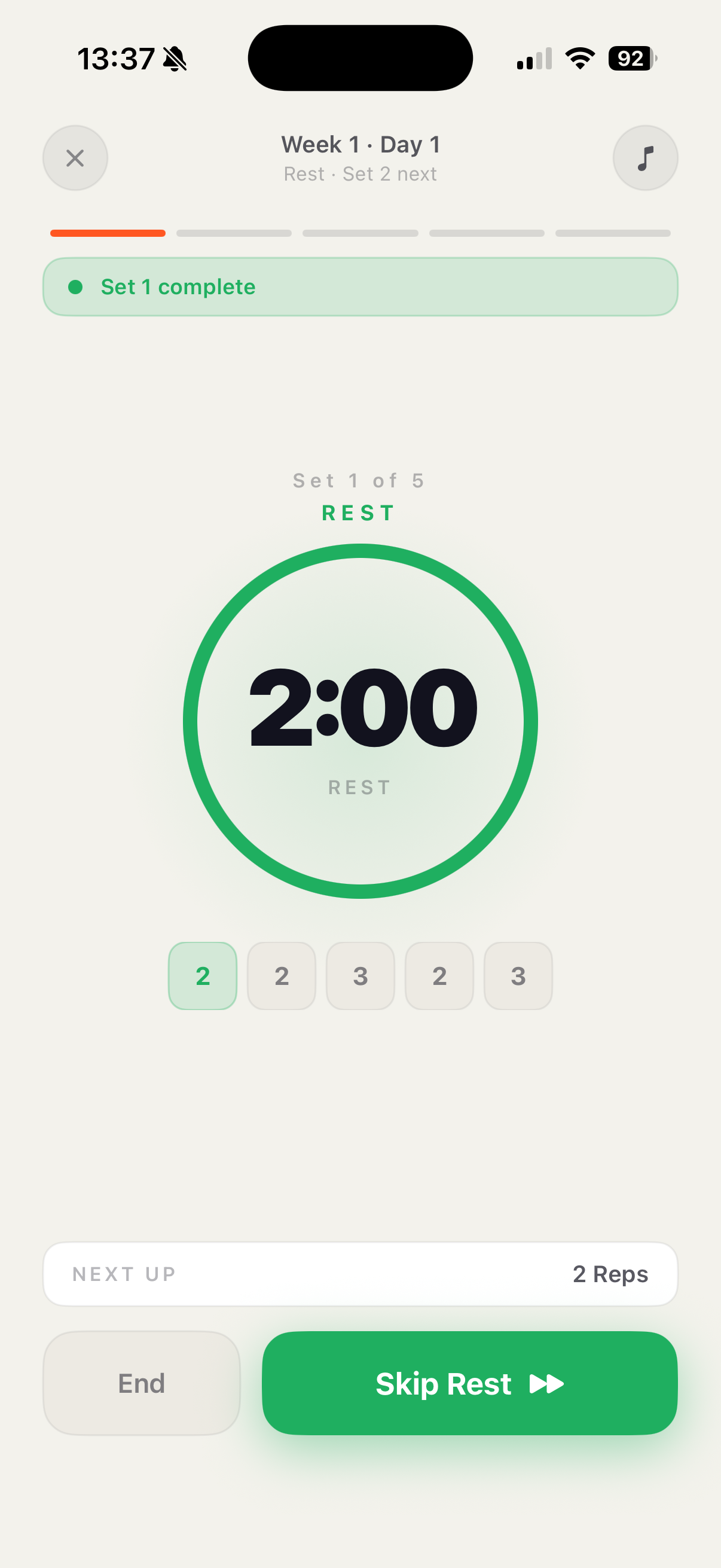
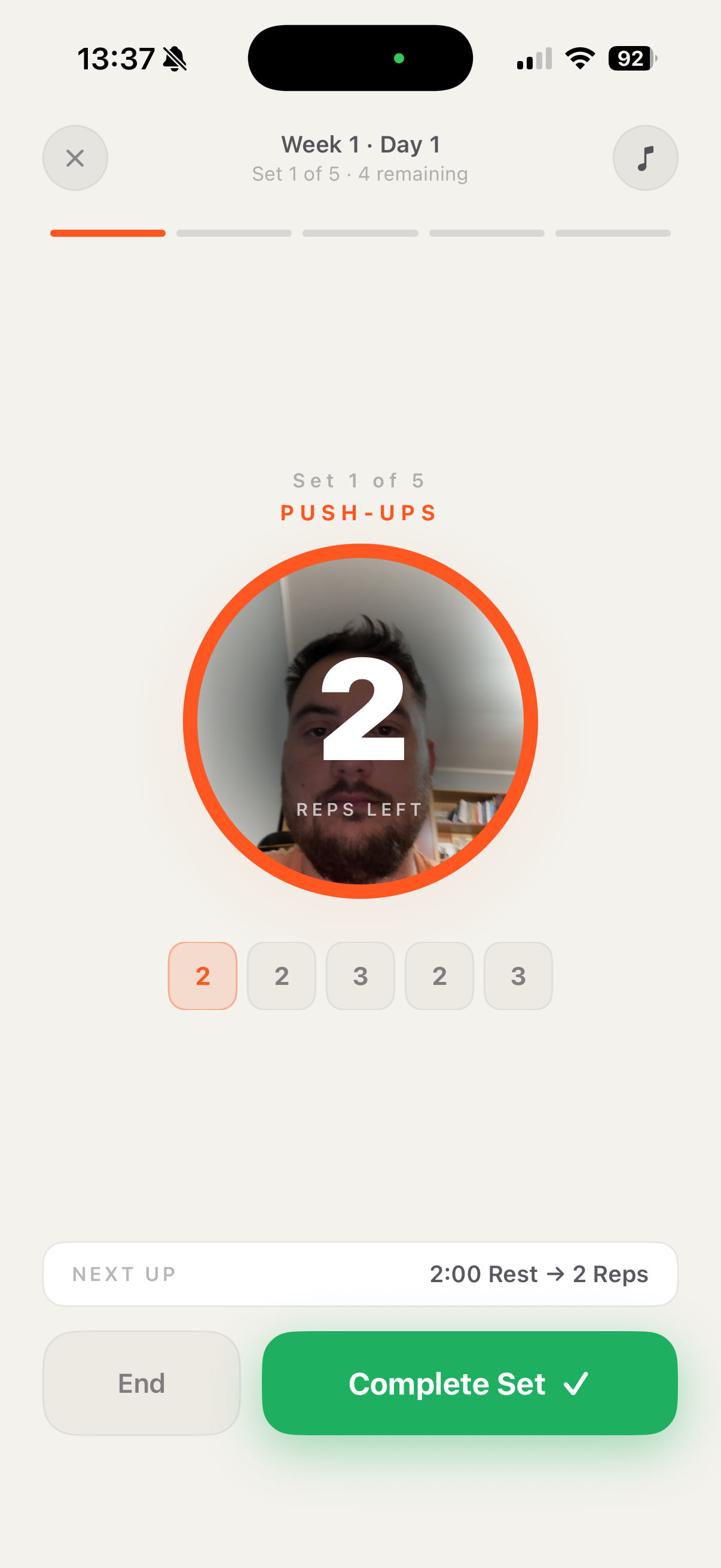
☀ After · Light